
Would you like to save this?
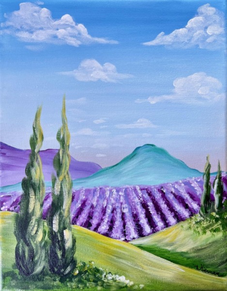
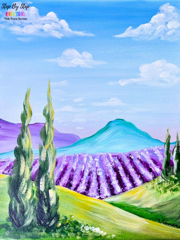
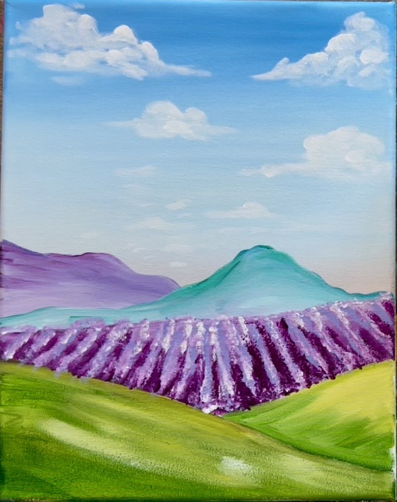
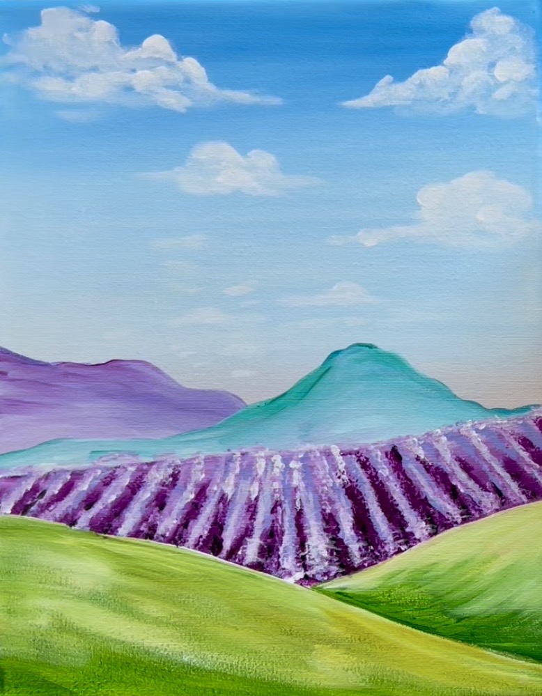
Escape to the countryside with this beautiful and easy Lavender Fields acrylic painting! In this beginner-friendly tutorial, you’ll learn how to paint vibrant rows of blooming lavender stretching toward distant hills beneath a bright blue summer sky. Along the way, we’ll practice creating soft, fluffy clouds, blending rolling landscapes, and adding tall cypress trees to complete this peaceful Provence-inspired scene.
This step-by-step lesson is perfect for beginners and uses simple brush techniques to create depth, texture, and color.
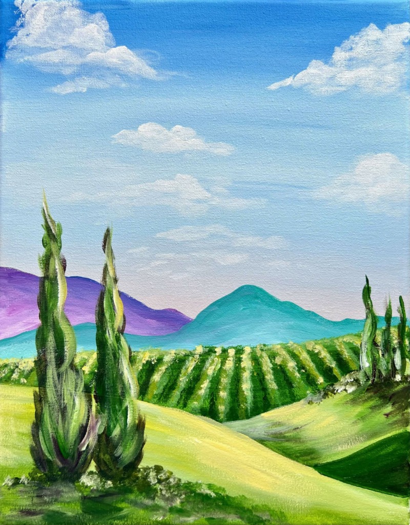
Grapevine Tuscany Design Variation:
I also did this painting with green grapevines instead of lavender! If you like the look of the grapevines, you would follow the steps the same but instead of “purple” you would use green (with variations of lights and darks in the greens).
Another idea to “add” to this painting is painting hot air balloons in the sky!
Enjoy and happy painting!
Materials:
- Acrylic Paint (I like Liquitex BASICS)
- Brushes (see sizes below)
- Ruler
- Pencil
- 11×14 Canvas (or any size!)
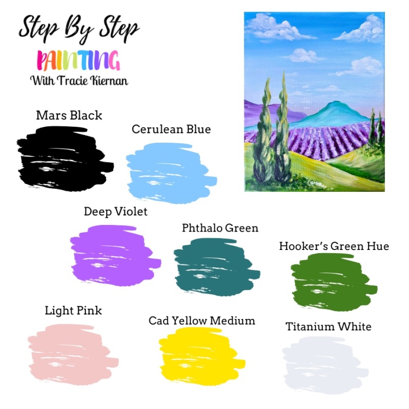
Colors:
- Cadmium Yellow Medium Hue
- Hooker’s Green Hue
- Phthalo Blue
- Cerulean Blue
- Mars Black
- Titanium White
- Deep Violet
- Light Pink
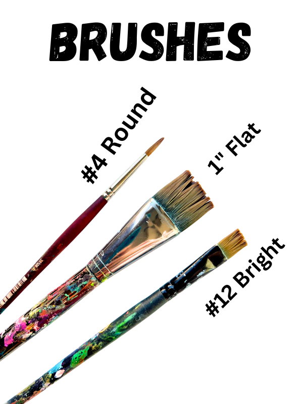
Brushes:
- 3/4″ Flat Wash Brush
- #12 Bright Brush
- #4 Round Brush
Color Palette:
Directions At A Glance:
Video:
Coming soon!
Step By Step Instructions:
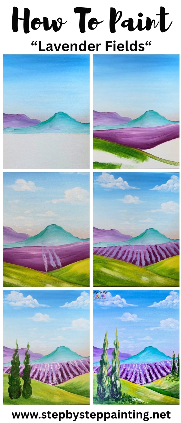
1. Paint Sky
Use a ruler and pencil to draw the horizon line at approximately 1/3 the height of the canvas. Draw the line lightly.
Load your paint palette with the colors: cerulean blue, titanium white and light pink. Use the 3/4″ flat wash brush and mix equal amounts of blue and white together to create a pretty light sky blue.
Paint left and right paint strokes at the top of the canvas. Go down about a quarter of the way of the sky then load the brush into titanium white (without rinsing the brush). Blend the white into the blue to create a lighter blue in the middle of the sky. Blend this together for a smooth gradient transition.
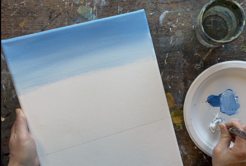
Then load the brush into more white and go down to almost the horizon line. Your sky should get gradually lighter as you blend down.
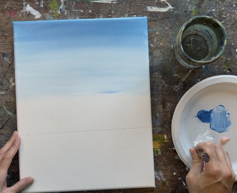
Leave about an inch gap on the bottom of the sky. Then wipe the brush but don’t rinse. Load the 3/4″ wash brush into “light pink”.
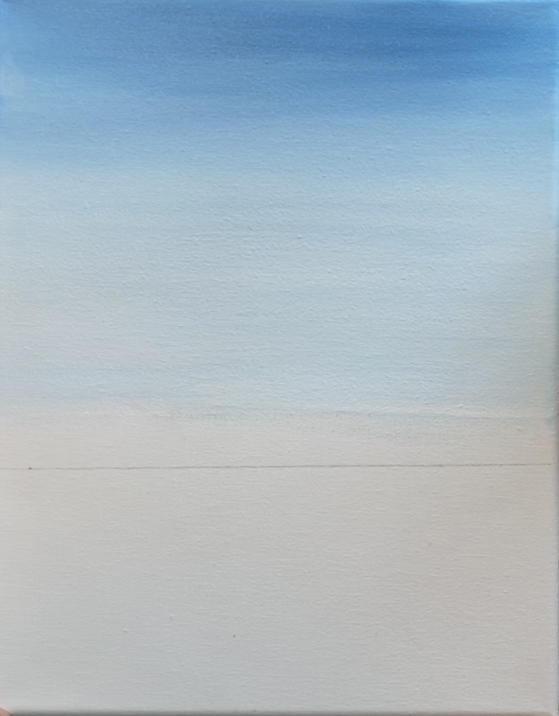
Blend the light pink at the bottom of the sky and up into the light blue area. Brush over the “transition zone” several times until the colors completely blend together.
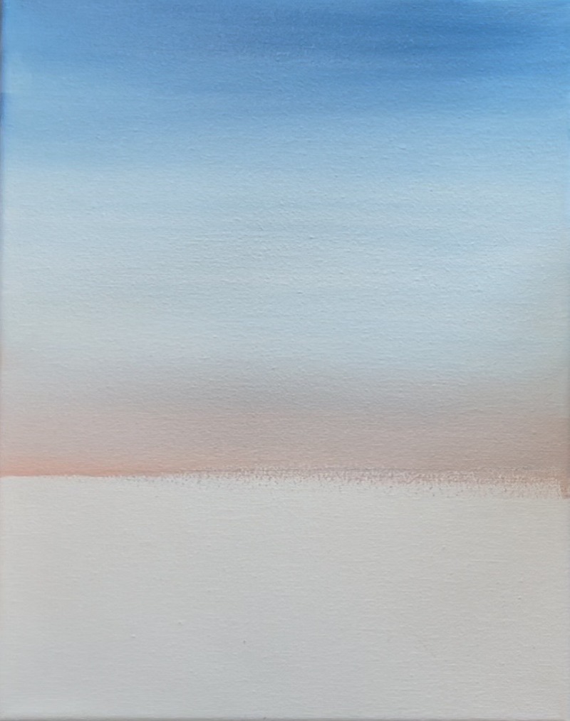
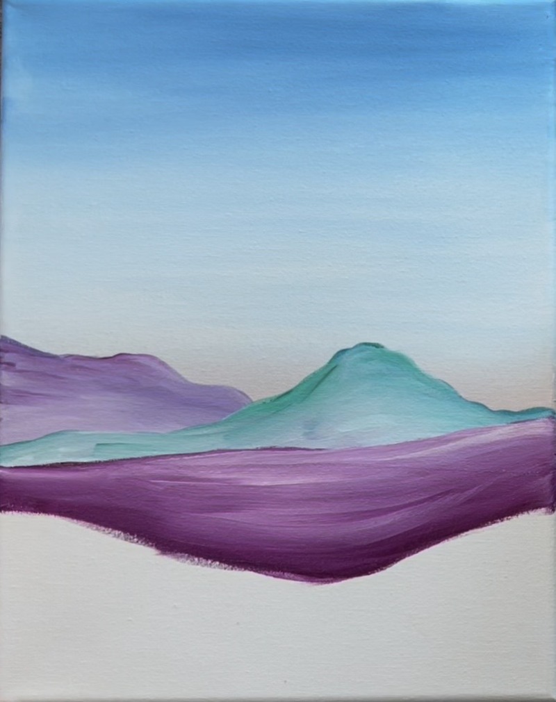
2. Paint Mountains
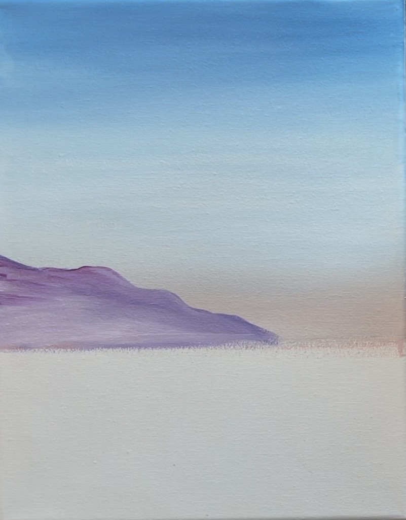
Mix a light blue-purple on your paint palette by mixing 1 part “deep violet”, 1 part “cerulean blue” and 1 part “titanium white”. Use the #4 round brush to paint the purple mountain. Start the mountain about 2″ above the horizon line on the left and paint a line that gradually descends down.
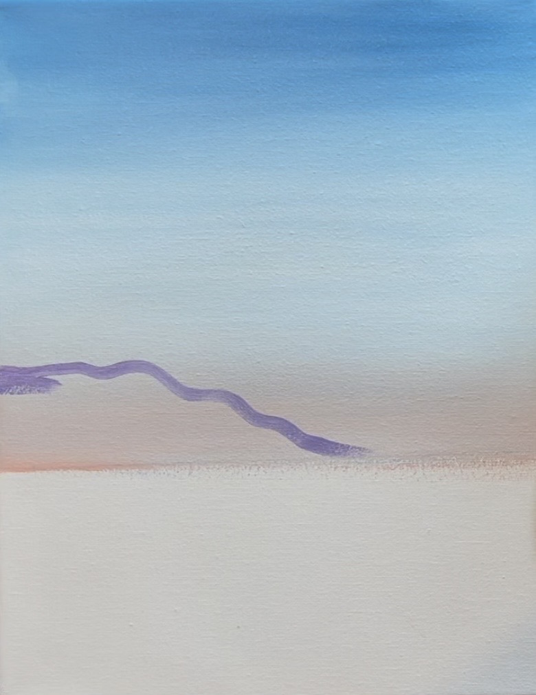
Fill this mountain in. Blend a little bit of darker purple at the top and more white on the bottom to create a gradient blend of dark to light on the mountain.
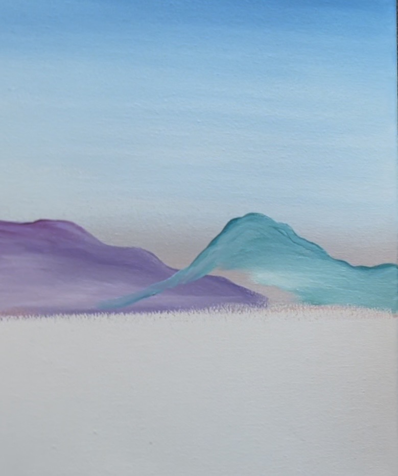
Then paint the light blue/teal colored mountain. On your paint palette, mix equal parts: phthalo green, cerulean blue and titanium white to create a pretty aqua color. Use the #4 round brush to paint a mountain of similar height to the purple mountain. This time, it overlaps the purple mountain. Paint a larger peak on the right side of the canvas and a lower level that sweeps down and covers the base of the purple mountain.
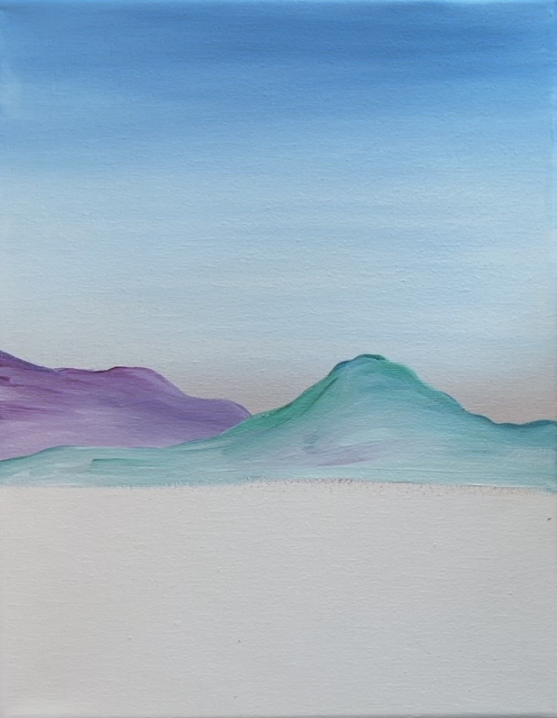
3. Paint Lavender Area (first layer)
Use the #12 bright brush for this step. You are going to paint a solid purple area where the lavender fields will be. Use the “Deep Violet” and define the area. This slopes slightly upward along the horizon line and goes slightly over the bottom of the aqua colored mountain range. Paint it a solid coat of “deep violet” but then blend white at the top so that it is slightly lighter at the top and darker on the bottom.
4. Paint Hills
Mix equal amounts of “Cadmium Yellow Medium Hue” and “Hooker’s Green Hue”. Use the #12 bright brush to paint the bottom hill. Use the edge of the brush to define the line. It starts out at about 3.5″ from the bottom of the canvas (or just below your purple area) and swoops down to the far lower right of the canvas.
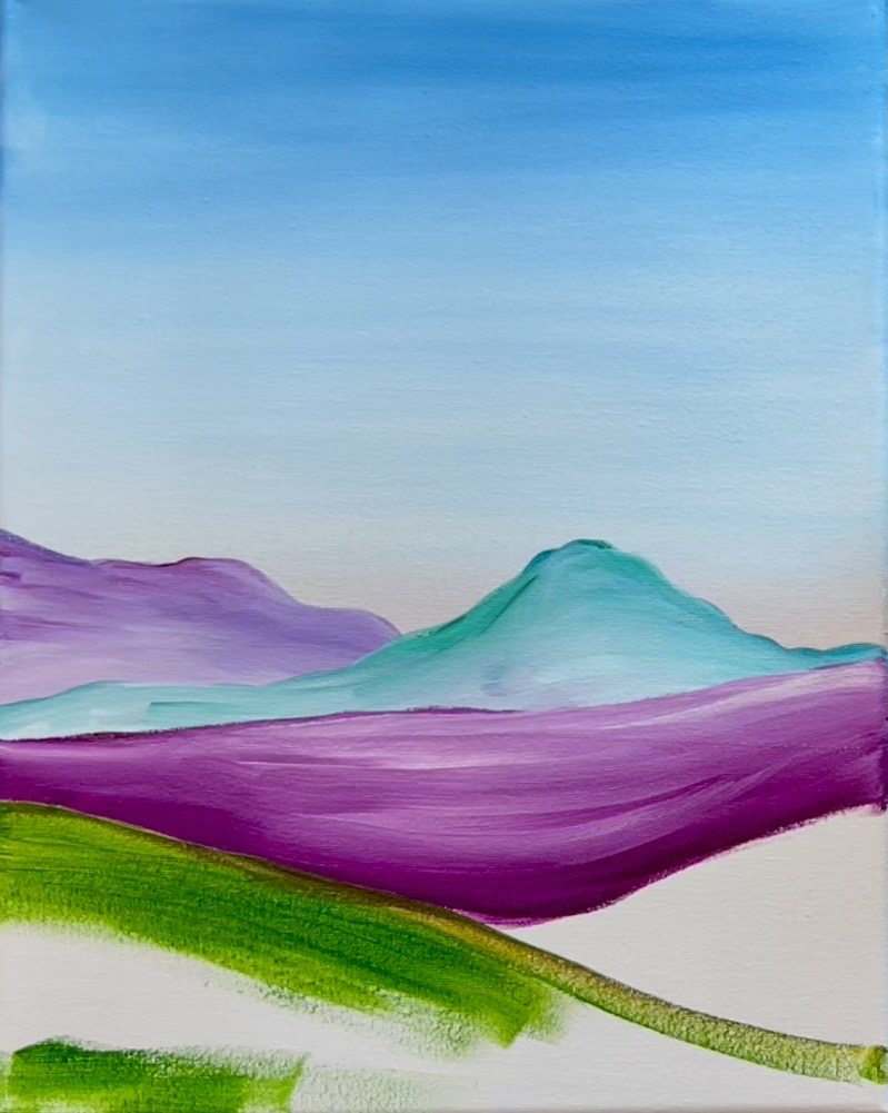
Fill it in solid. Then paint the middle hill on the right. This one is a lighter color so mix in more yellow and some white into the color you just used to create a light green-yellow. Paint the hill and then blend a little darker green on the lower left of that hill.
Note: if your purple and green run into each other and mix, you can re-touch it later after it dries.
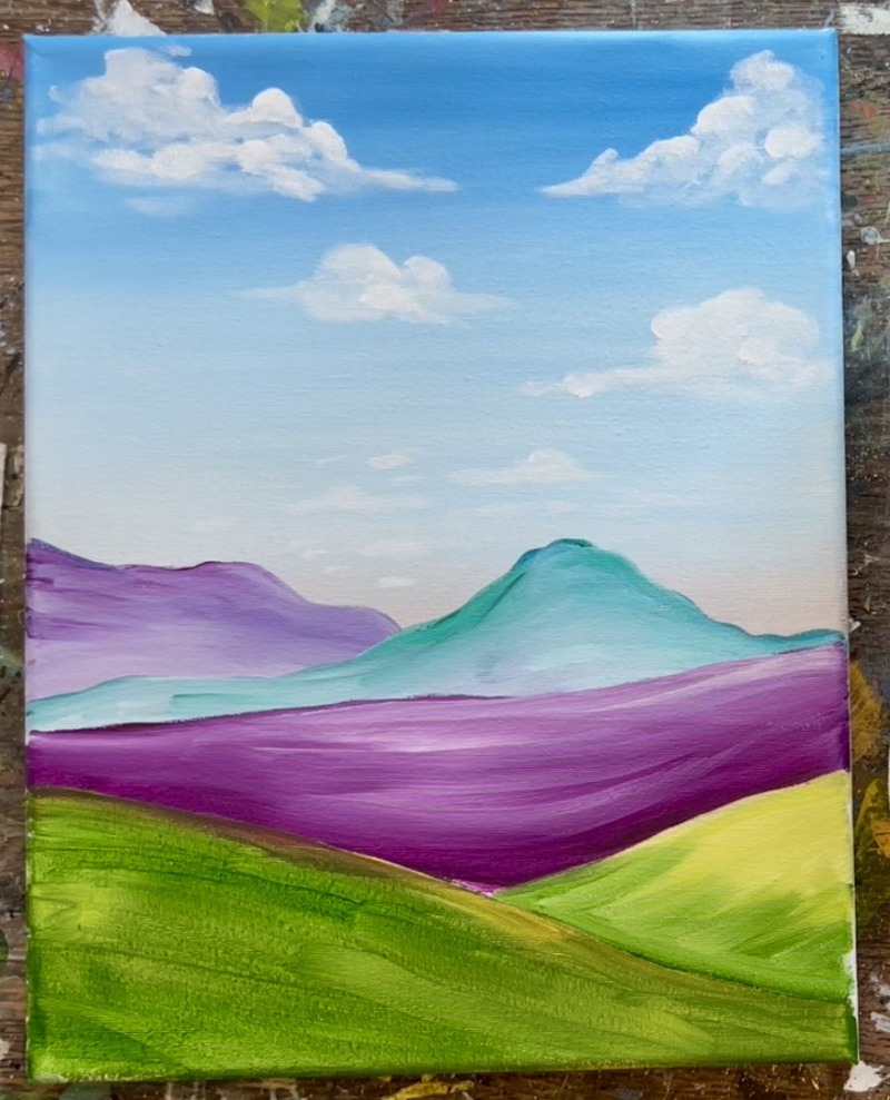
5. Paint Clouds
Use the #12 bright brush to paint “dry brush style” clouds. I recommend having a paper towel handy for wiping the brush off between paint strokes. First, load the end of the flat brush into titanium white. Then wipe the brush off. This ensures your stroke will be translucent on the canvas. Then form the shape of your first cloud by painting rounded paint strokes using just the tip of the paintbrush.
Paint larger clouds higher in the sky and smaller, flatter clouds closer to the horizon.
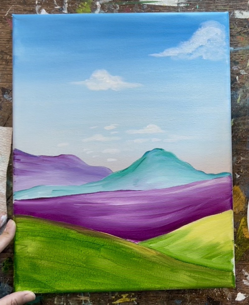
Next, highlight your clouds using more white. This time, add another layer to just the top edges of the clouds. Do the same dry brush style paint strokes and create rounded “tops” for the clouds. This will show up brighter than your first layer. Don’t cover all of your first layer, just paint these on the tops of the clouds.
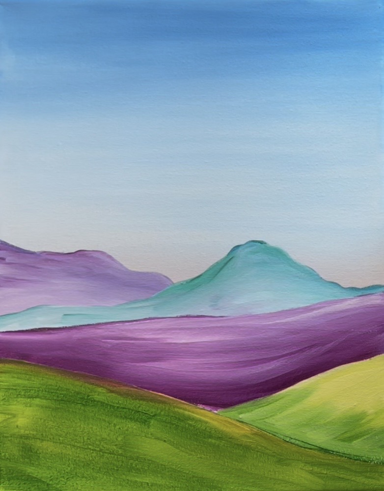
6. Paint Lavender Field Layers
Mix on your paint palette equal amounts of: deep violet, cerulean blue and titanium white to make a light blue-purple color. Use the end of your #12 bright brush to “stamp” lines to define the rows of lavender. This color should show up lighter than the first purple layer that you did. If not, add more white into it.
When you paint these rows, stamp the brush and allow the rows to be wider in the front but go more narrow in the back.
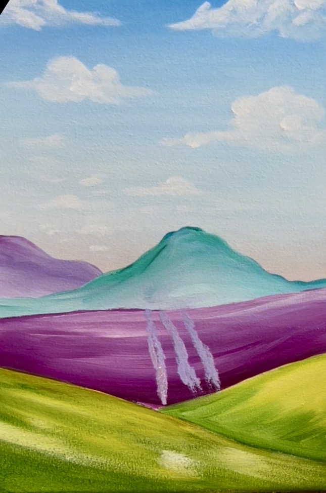
Paint rows about a half inch apart. The rows on the right side of the painting tilt to the right while the row on the left side of the painting tilt to the left.
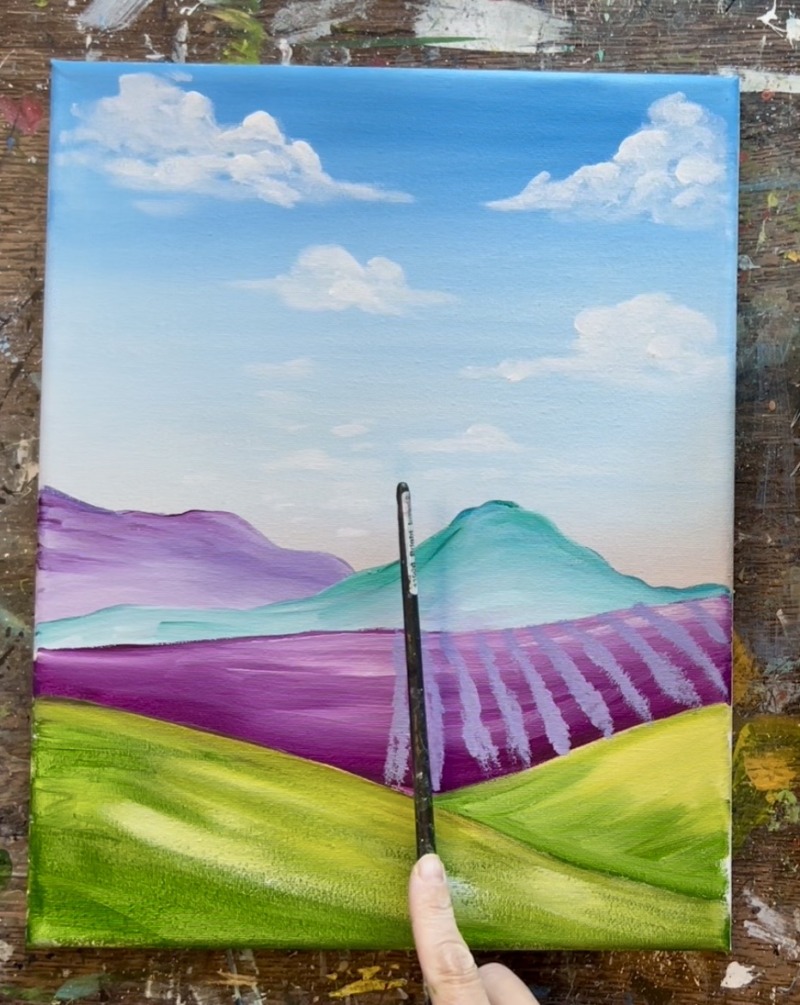
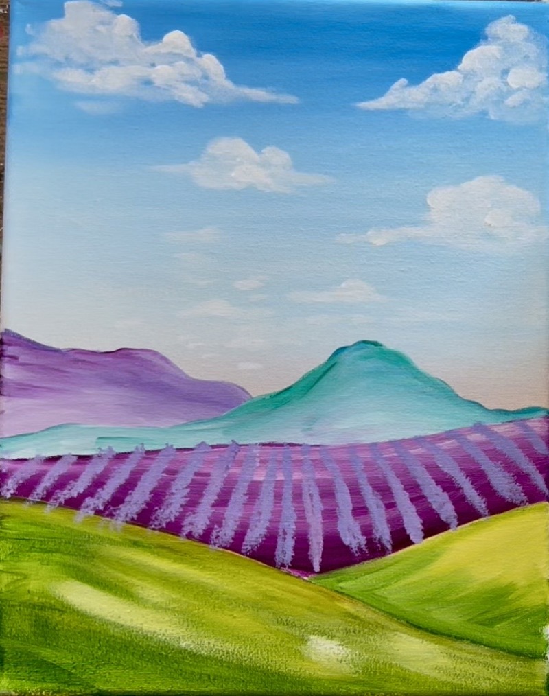
Next, rinse the brush. Load it into just “deep violet”. Stamp this dark purple in between the rows. This time, don’t paint the dark all the way back (go about 3/4 of the way and stop to let it fade out).
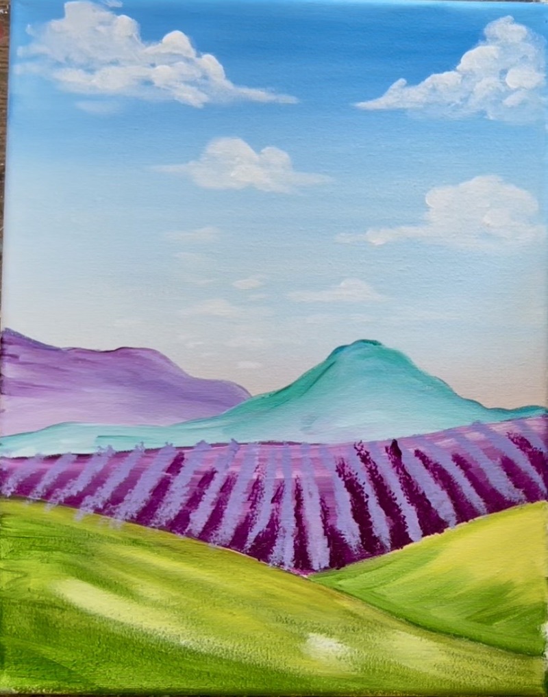
Think abstract for these lavender rows! Next, wipe the brush but do not rinse. Double load into both “deep violet” and “titanium white” (no blue this time). Then stamp this light color over your purple-blue rows.
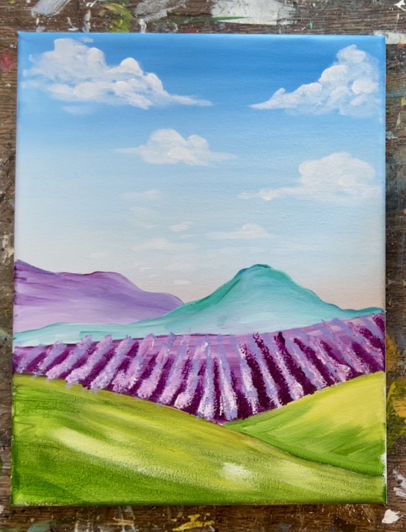
Wipe the brush and then load in a tiny bit of “titanium white”. Add white stamps way in the back to highlight the rows in the back.
7. Touchup Hills
After painting the lavender rows, you may have covered up parts of the hills in the front. Use the same green for the hills to repaint over any parts of the lavender that may be overlapping.
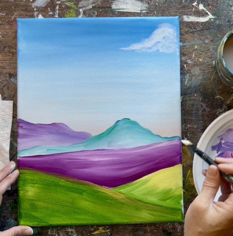
8. Paint Cypress Trees
Use a #4 round brush for this step. Mix a small amount of “Mars Black” into “Hooker’s Green Hue”. Start at the bottom of the tree and paint curved paint strokes that go from the bottom and slightly curving upwards. As you paint this tree, your vertical “column” should get more narrow and eventually go to a curvy point.
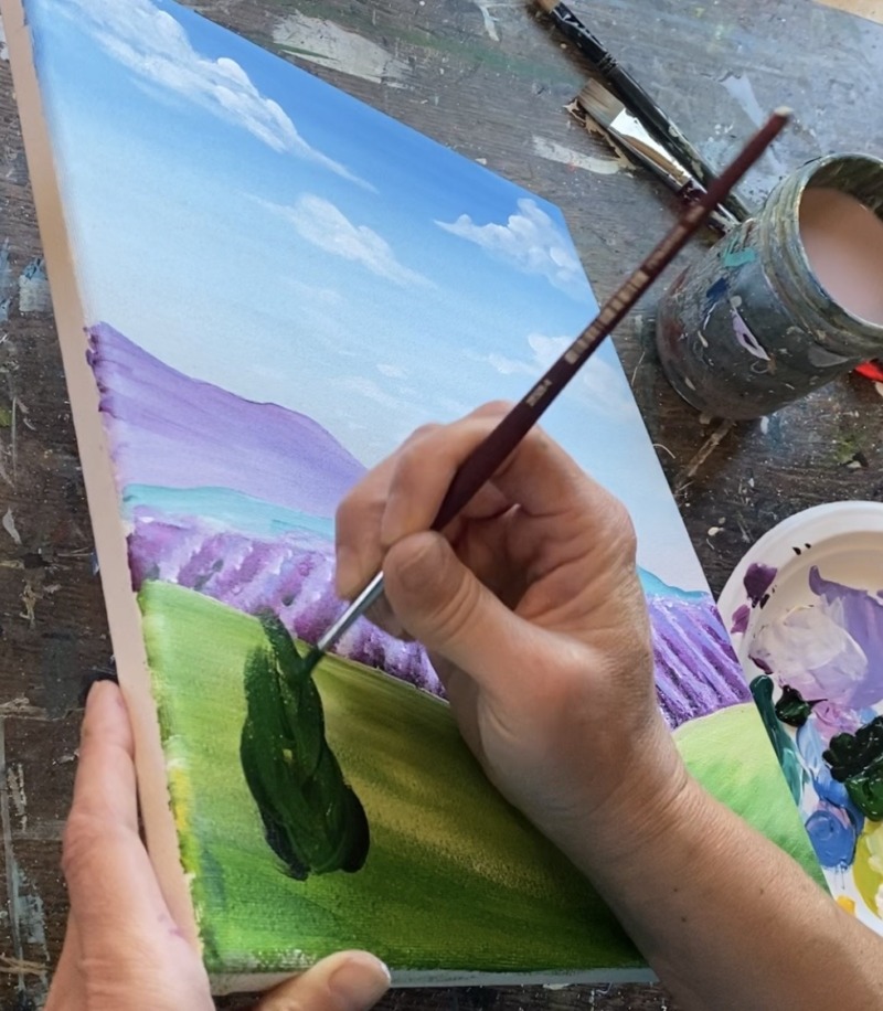
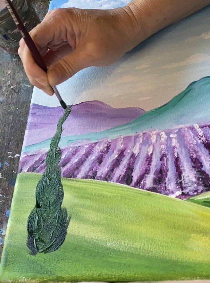
Repeat this to paint two similar size trees next to each other.
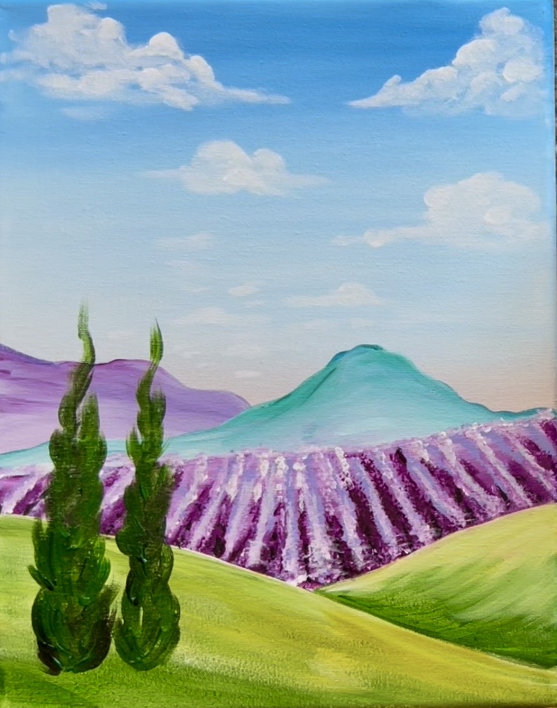
Paint another set of cypress trees in the background (but smaller). Add some white into the dark green you just used (so they are slightly lighter because they are further back).
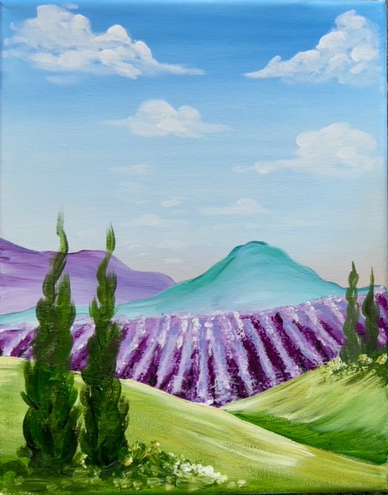
Then “stipple” greenery on the bottom of each of the sets of cypress trees. Start by using just your dark green to paint little dots/ small marks that form a small pile next to the trees. Then add white and yellow to the brush along with your dark green and stipple highlights on the tops of the greenery for added color and texture.
Highlight your cypress trees when that first dark green layer dries. Use a combination of the green mixed with yellow and white. Repaint the right side of the larger trees but leave the left side dark and shadowy. When you do these same brush strokes, try not to cover all of your first dark layer.
9. Final Touches To Lavender Fields
I added more layering to the lavender fields by painting another light purple layer (deep violet mixed with titanium white) over the lighter color rows (not over the dark areas). Make sure the bottom of the rows are wider but go narrower in the back. In the center of all of those, add just a touch more white for extra highlighting.