
Would you like to save this?
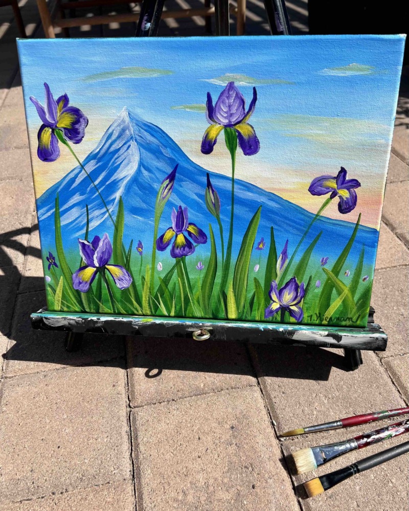
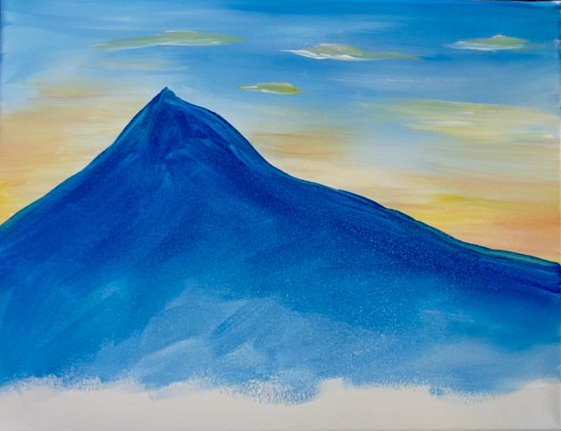
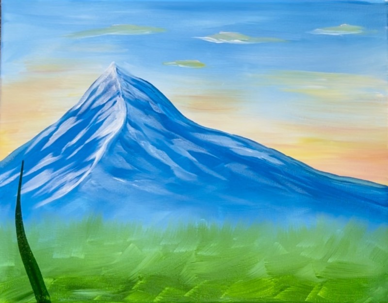
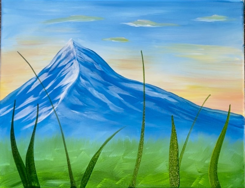
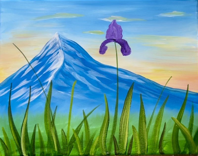
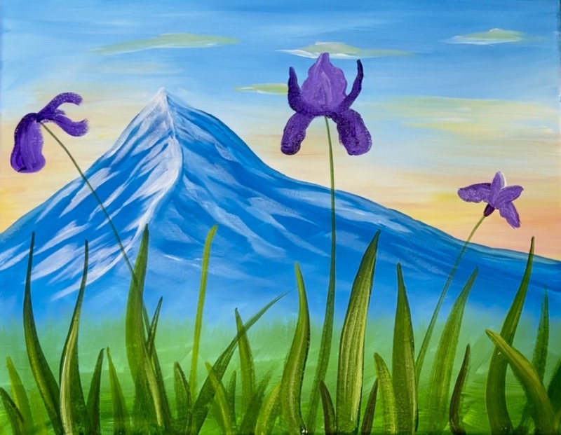
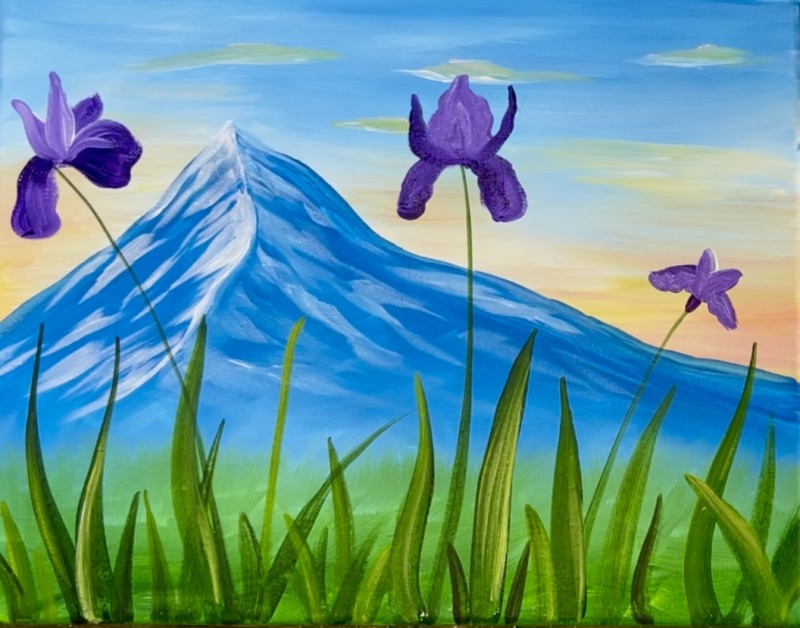
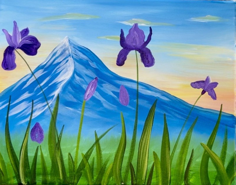
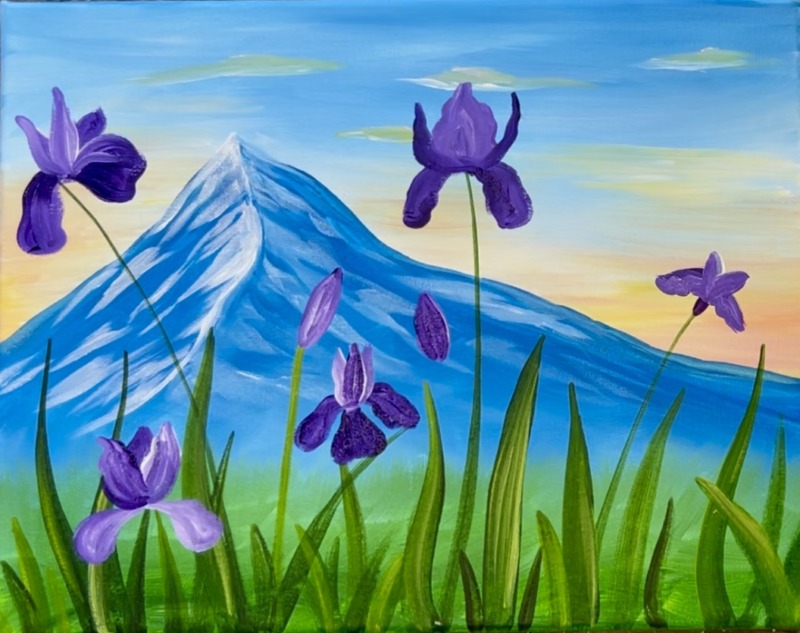
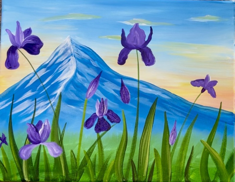
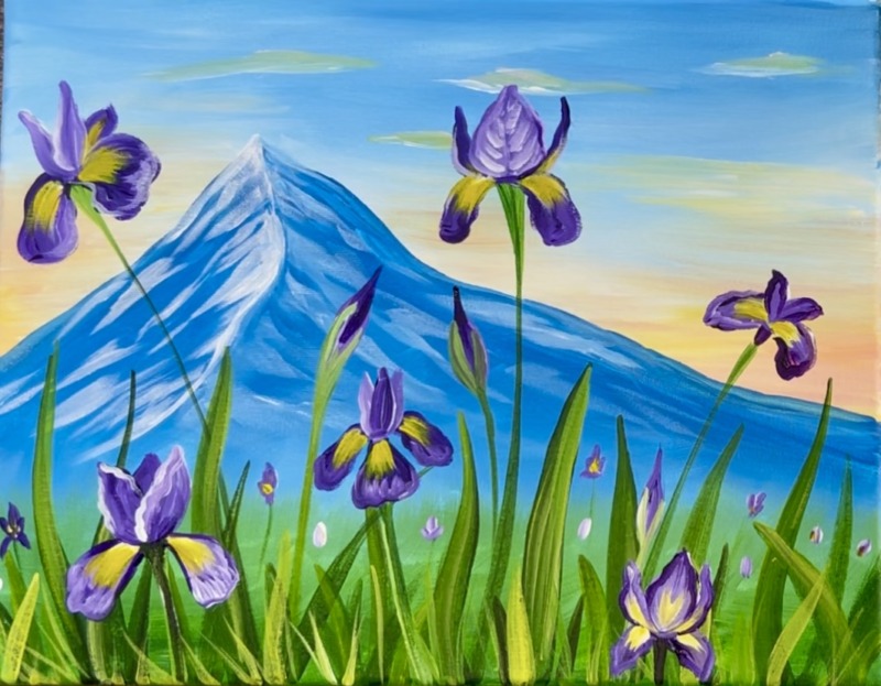
“Mountain Irises” is a spring landscape painting with a large majestic mountain in the background. Learn to paint “stylized” irises in a grassy field. There is a soft pastel sunset glow just above the mountain.
Enjoy and happy painting!
You can download this tutorial in my PDF shop! This includes bonus traceables and the ability to download the video. Find out more!
Materials Needed
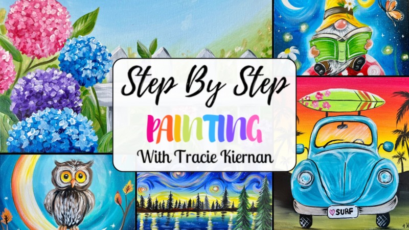
Mountain Irises
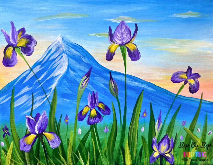
Purple Irises peek out from behind a majestic mountain. This tutorial will show you how to paint purple irises step by step.
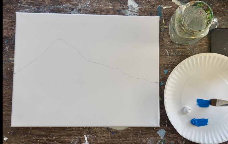
Materials
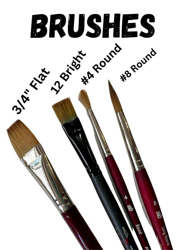
- 11 x 14 Canvas (or any size)
- Acrylic Paint (I use Liquitex BASICS but use any brand you want!)
- Paint Brushes (see below)
- Pencil
- Ruler (optional but helpful)
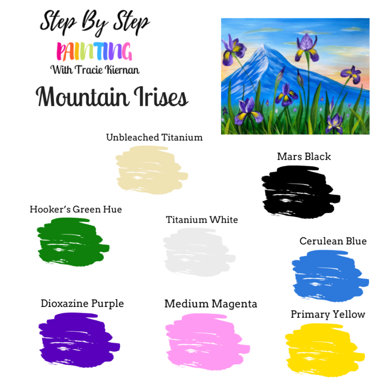
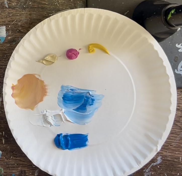
Colors
- Titanium White
- Mars Black
- Unbleached Titanium
- Medium Magenta
- Primary Yellow
- Dioxazine Purple
- Hooker's Green Hue
- Cerulean Blue
Brushes
Color Palette
Directions At A Glance
Video
Step By Step Instructions
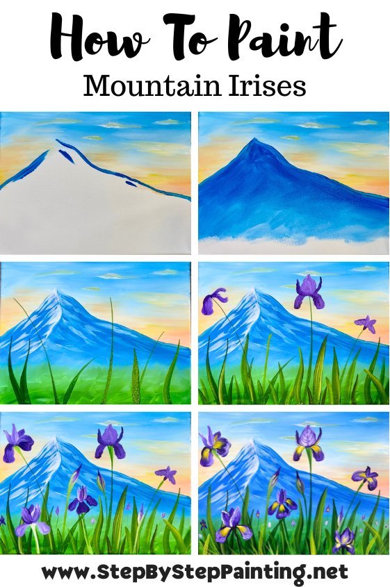
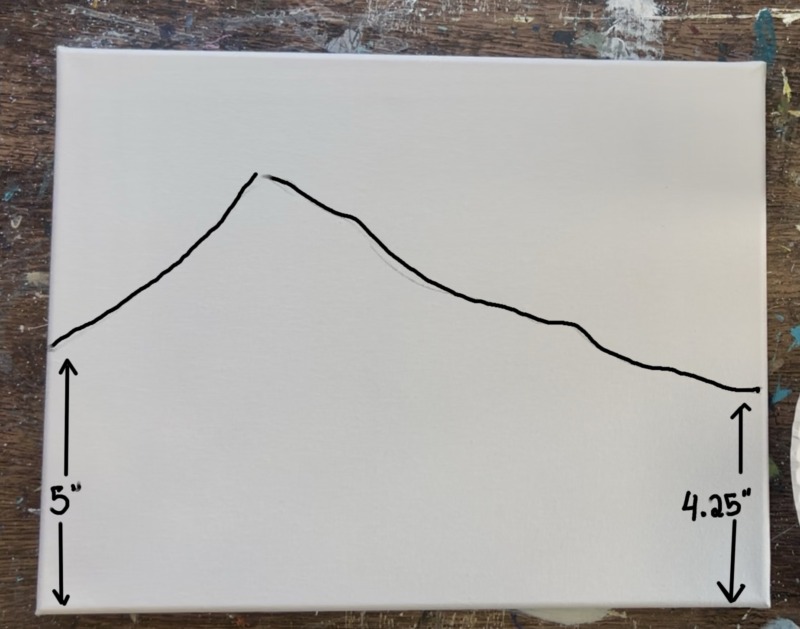
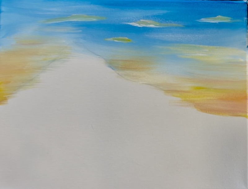
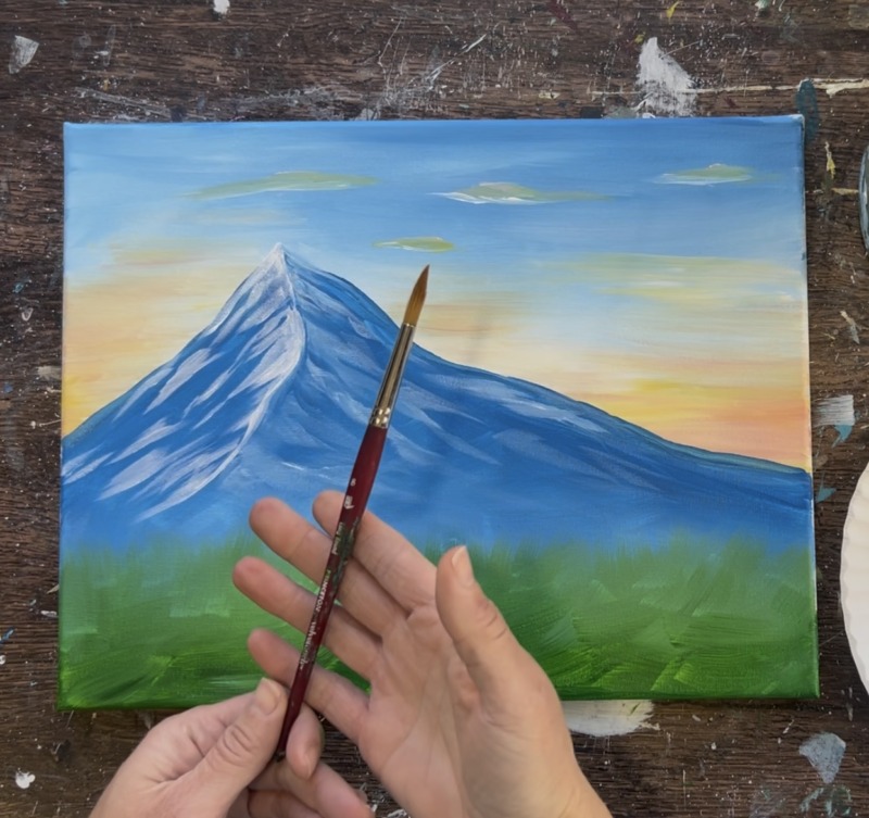
1. Draw Mountain & Paint Sky
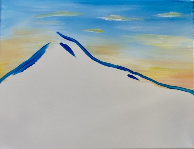
Position your canvas so that it is horizontal. Use a pencil to lightly draw a mountain with a high peak on the left side of the mountain. Start on the left side of the canvas about 5″ from the bottom edge of the canvas. Draw a very steep peak and then gradually draw a diagonal/ slightly jagged line to about 4.5″ from the bottom right edge of the canvas.
Then paint the sky. Use the 3/4″ flat wash brush. Double load the brush into the colors “cerulean blue” and “titanium white” (equal amounts). Start at the top edge of the canvas.
Paint very loose and slightly angled paint strokes. Paint the top quarter of the sky with this “cerulean blue” mixed with “titanium white”. The two colors will blend on the canvas. We want the sky to be darkest at the top and lighter as it reaches the “horizon line” or areas just above the mountain.
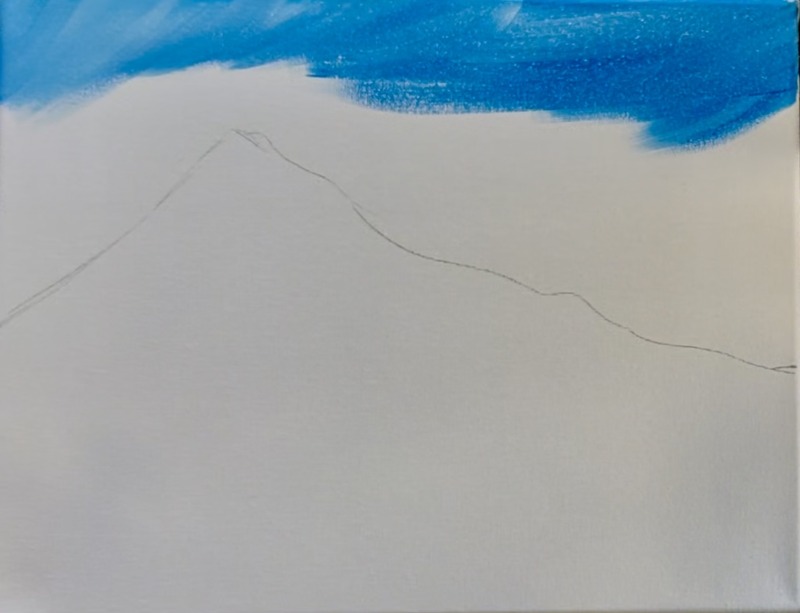
Wipe the brush off. Then load “titanium white” onto the brush and blend more of this white into the sky to allow the sky to get lighter as you approach the “horizon line”. Leave about a 1″ area of space blank above the mountain line (not counting the peak).
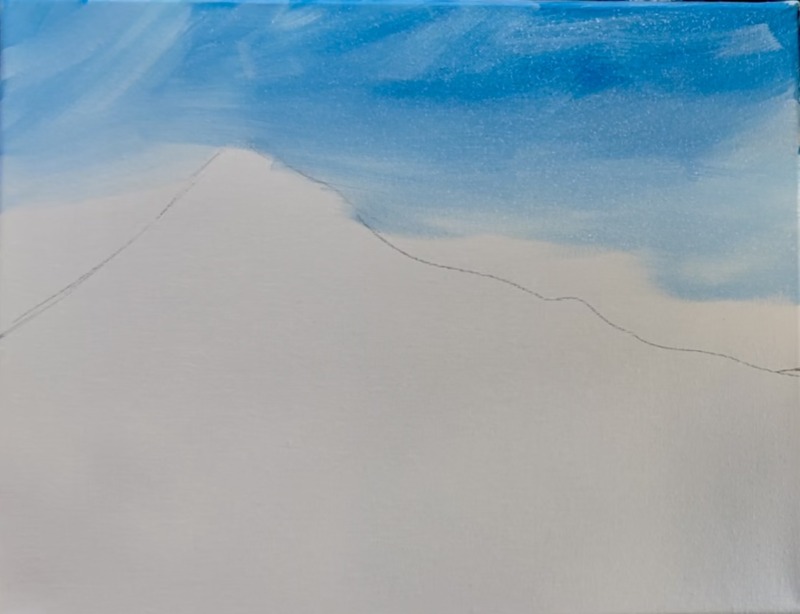
Rinse the brush. Then load it into just “titanium white”. Paint about 1″ of an area just above the mountain line with white. Blend it with the light blue. You now have a sky that is darker at the top and very light just above the mountain. In the next step, we will add sunset colors into the sky.
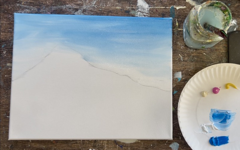
Load your paint palette with the three colors: “unbleached titanium”, “medium magenta” and “primary yellow”. Rinse the 3/4″ flat wash brush. Then mix equal amounts of all three of the colors (beige, pink and yellow) together. This will make a peach/ coral color.
Load a small amount of this on your 3/4″ flat brush. Then gently paint the bottom portions of the sky where you painted white over initially.
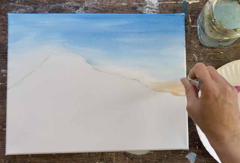
Lightly paint this color just above the areas of the mountain. Don’t blend it into the blue (if the blue is still wet). If you mix it too much with the blue, the sky may turn a muddy color or green. Lightly apply the color over some of the blue areas but don’t brush it in too much.
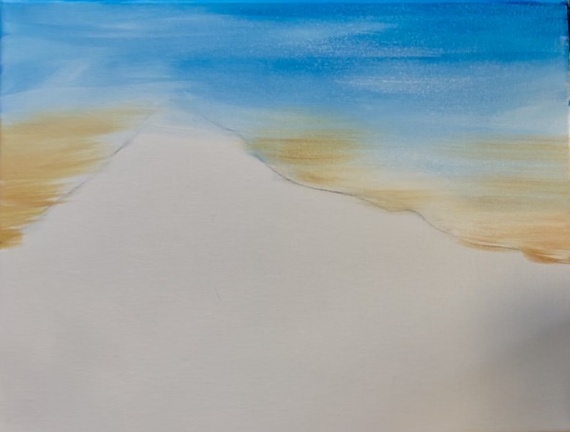
Add pops of brighter yellow and some extra pink on the bottom of the sky. Then paint some flat clouds over the dark blue area of the sky. Do this by using just the edge of your brush to paint horizontal marks with the coral color. You can make these flat clouds have a little bit of “loft/ shape” but not too much.
Rinse the brush. Load it into just “titanium white”. Use the edge of the brush to paint white on the bottom of each of the clouds. This highlights those clouds gently.
2. Paint Mountain
Rinse the 3/4″ flat wash brush. Load it into pure “cerulean blue”. Use the edge of the brush to paint the outline edge of the mountain.
Then start to fill the mountain in with this solid blue color. Make your paint strokes go in the direction of the edges of the mountain. For example, the paint strokes go diagonally to the left on the left side of the mountain and they go to the right parallel to the right edge of the mountain.
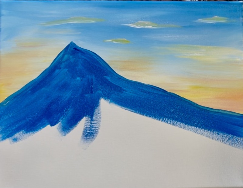
Leave about 1-2″ of blank space from the bottom edge of the canvas. Then load your brush in “titanium white” without rinsing the brush.
You now have both the “cerulean blue” and “titanium white” on your brush. Paint the base of the mountain. Paint this area with “criss-cross” “x” style brush strokes. Blend the white and blue onto the canvas. This will make the bottom of the mountain slightly lighter and give it kind of a “misty mountain” effect. The top edge of the mountain is darker. Leave about 1″ of blank space on the bottom edge of the canvas.
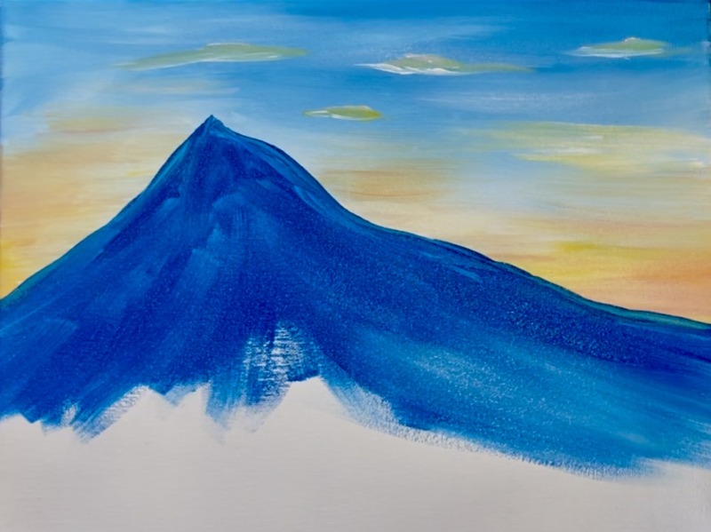
3. Paint Green Ground
Do not rinse the blue off your brush (you can wipe the brush if it is over loaded). Load your paint palette with the color “hooker’s green hue”. Load your brush into the green. Paint the bottom 1″ edge of the canvas with the green and paint left and right paint strokes across the canvas.
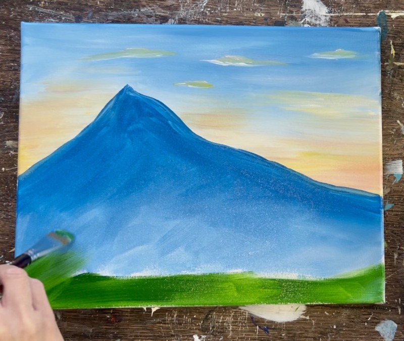
Then lightly brush the green up over the base of the mountain. Do this with very light/ feathery paint strokes. This goes up about 3″ from the bottom edge of the canvas and overlaps part of the base of the mountain. Let it blend with the light blue (if the light blue is still wet). This entire green area is done with “x” style expressive strokes. The top edge looks almost like grass texture. You can create this effect by almost “dry brushing” the color and dragging it in upward directions. Don’t load a lot of paint on the brush, keep it very light and feathery along the top edge where it overlaps the mountain.
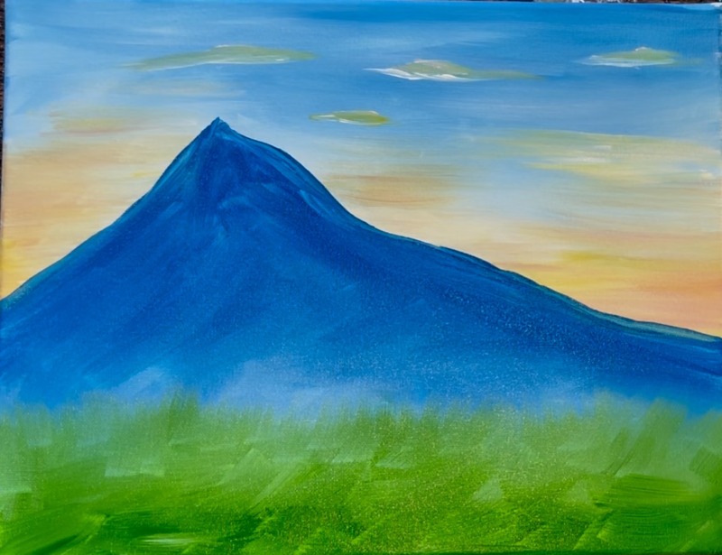
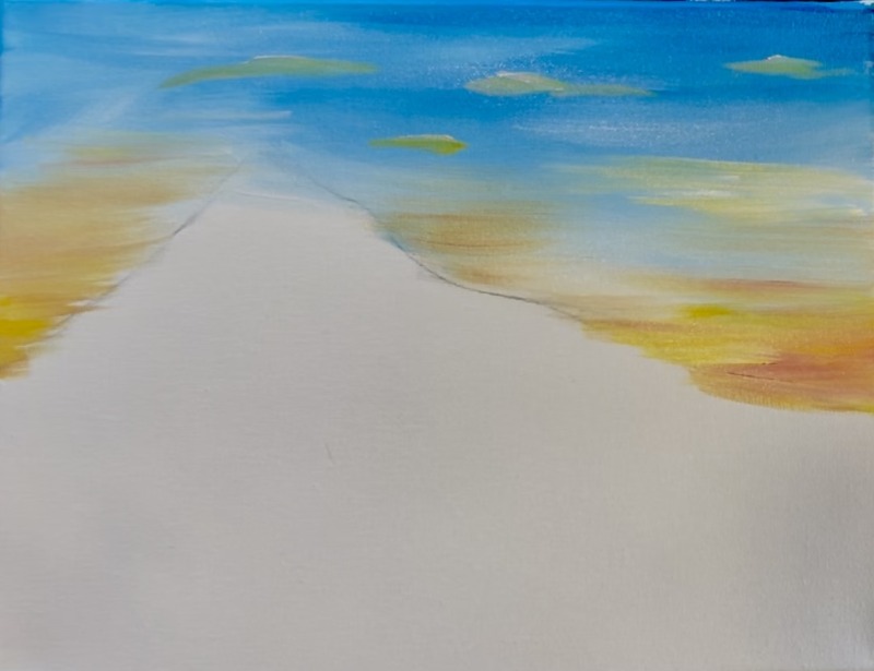
4. Paint Highlights (Snow) On Mountain
Use the #12 bright brush (1/2″ flat) for this step. Load the very edge tip of your brush into the color “titanium white”. Use the edge of the brush to divide the mountain in half from the top peak and down to almost the base of the mountain where it meets the green. Make your line very loose and “jagged” and bend the light slightly to the left.
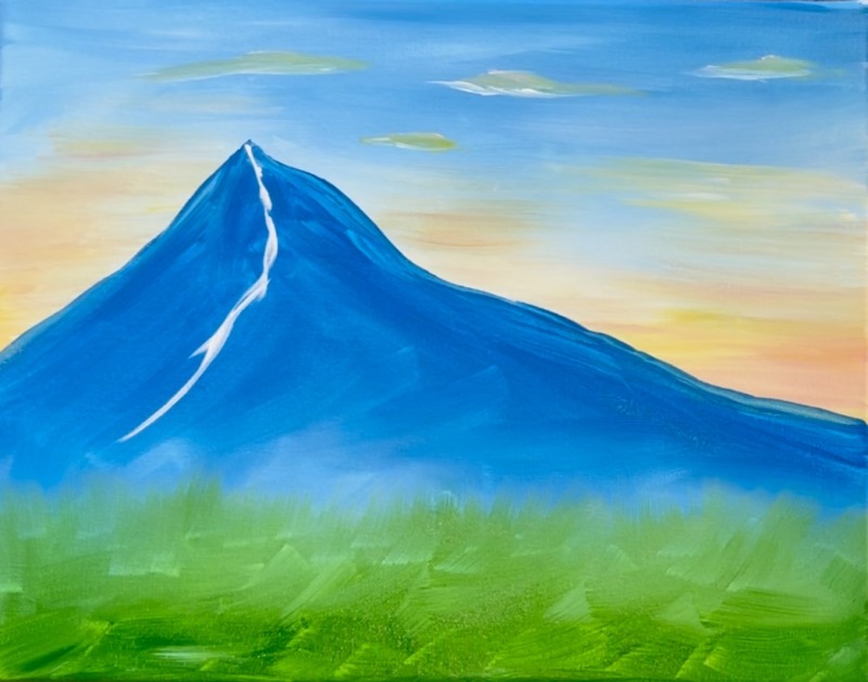
Then paint white highlights/ snowy areas on the mountain. Do this on the left side of your mountain division line. Paint little wavy/ edgy shapes that go diagonally to the left parallel to the left diagonal line of your mountain edge.
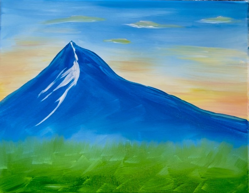
Create more of these loose/ edgy shapes all going in the same diagonal direction.
Next, you want to do similar shapes on the right side of the mountain but they need to be less bright than the left side. To make these less bright, mix some “cerulean blue” with “titanium white” to make more of a light blue color. Paint the same style of edgy/ shapes but go the opposite direction.
Again, make sure this right side of the mountain has the texture that shows “dimmer” than the left side. If needed, go back and add more white on the left side, especially along the middle mountains “edge line” you painted initially.
Make sure everything is dry before going onto the next step.
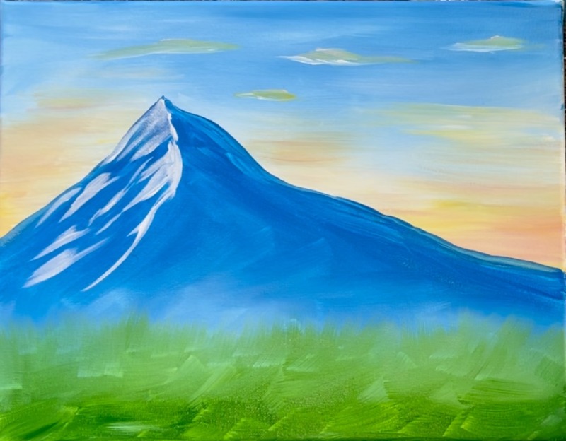
5. Paint Stems & Leaves
Use a #8 long round brush and the color “hooker’s green hue”. If you don’t have this exact brush, I recommend a round brush that has a fine point to it. The fine point will help you make these leaves pointed on the ends.
Start by mixing a very small amount of “mars black” into “hooker’s green hue”. Our first set of stems and leaves will be a very dark green. This should be dark enough to show up against the green layer of paint you have on the bottom of the canvas.
Load your 8 round brush in the green. Sort of twist the brush to make sure the paint is gathered right at the end of the point. You may need to add a little water to the brush as well to loosen the green paint.
Paint your first iris leaf. You can either start at the top and brush downward or start on the bottom and brush upwards. Either way, you need to vary the pressure of the brush. For a thin line, use only the tip of the brush and for thick, press down firmly. Change the pressure from thick to thin to create the leaf blade.
Repeat this several times to create a few leaves of varying heights and angles. Then paint three stems. The stems are very thin lines so use just the point of the brush to create the thin brush stroke. You can make the stem go a little thicker as you work to the bottom edge of the canvas. Each of these three stems go very high! They reach up higher than the mountain top because of the perspective on this painting.
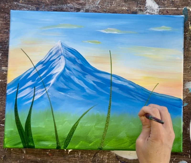
You can start to alter the color of the green. Try doing just “hooker’s green hue” with no black. You can also try mixing a little “primary yellow” or “titanium white” into your green for lighter colors. The point is to layer on multiple tints and shades of green for the leaves.
Paint several more leaves of varying heights and a few more stems. If you don’t have all your stems painted for where you want the irises to go, that is okay! We can always add more stems later for more flowers.
Paint smaller leaves on the bottom of your ground area that don’t go very high. Overlap these leaves and make them go in different directions.
I like to add a little “color variation” into my green leaves that I already painted. To do this, use the 8 round brush to brush on lighter colors over some of the darker leaves. By “lighter colors” this could mean “green mixed with yellow” or “green mixed with yellow and white”. You can brush over one side of the leaf to highlight them.
You don’t need to wait for everything to dry for this next step.
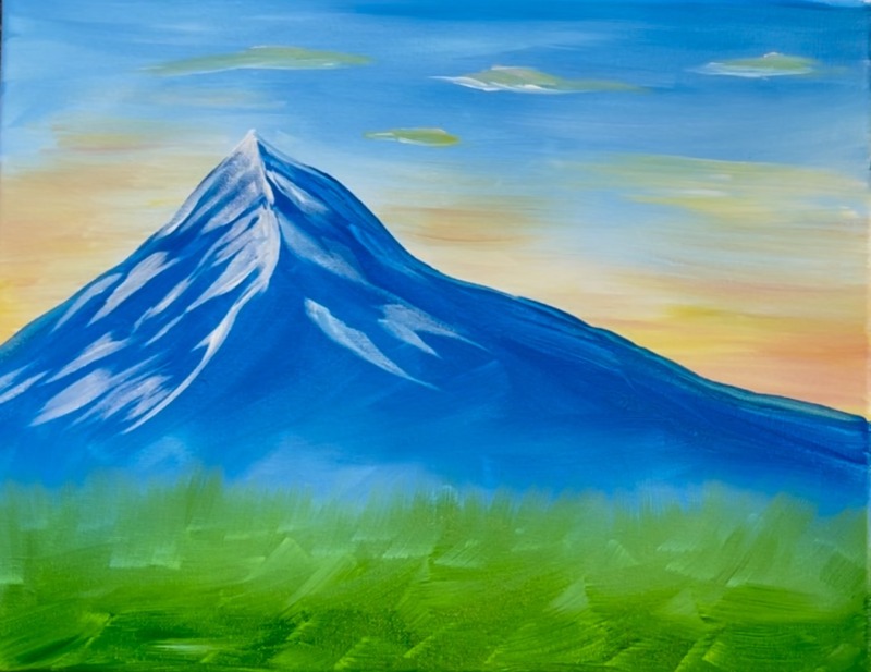
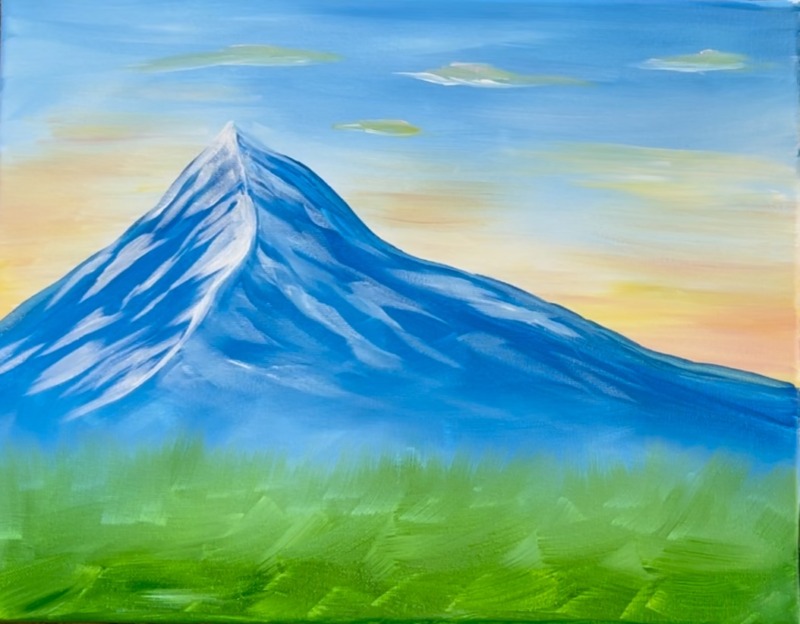
6. Paint Irises
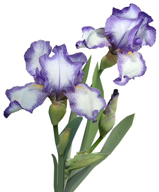
I recommend looking at photos of irises. It also helps to look at “iris clipart” since we will be simplifying these irises and not making them look realistic. Irises have three petals going downwards. These are the “falls”. The upward petals are the “standard” and there are typically three going upwards. When we paint these irises, we may not see all 6 petals. It’s also possible each iris is in a different phase of its blooming cycle (such as just a bud or all the way bloomed).
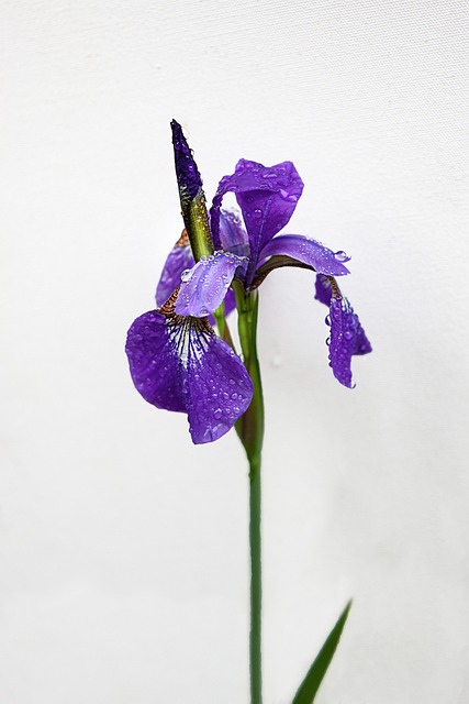
There are different variety of irises too ranging from different tints of purple, different shaped petals. Some have very wavy texture on the edges of the petals.
After observing a few photos and clipart illustrations of “irises”, we are going replicate this on the canvas! Right now the focus is on applying the petals and getting the shapes on the canvas. Don’t worry about highlighting or shading anything yet.
Use the #4 round brush and “dioxazine purple” and “titanium white”. Double load the brush into purple and white (this will create lighter tints of purple on the canvas). Then start your first flower. This one has a large upward petal and two downward petals.
Then add two more slender upward petals. When you paint larger petals, make the edges sort of wavy. You can do this by sorta of wiggling your brush to create a wavy edge.
As you paint each iris, you want to slightly change them. They are all similar in style but the angles and heights change slightly. I painted the tree irises that are above the mountain first. Almost all of them have two or three down petals showing and two or three upward petals showing.
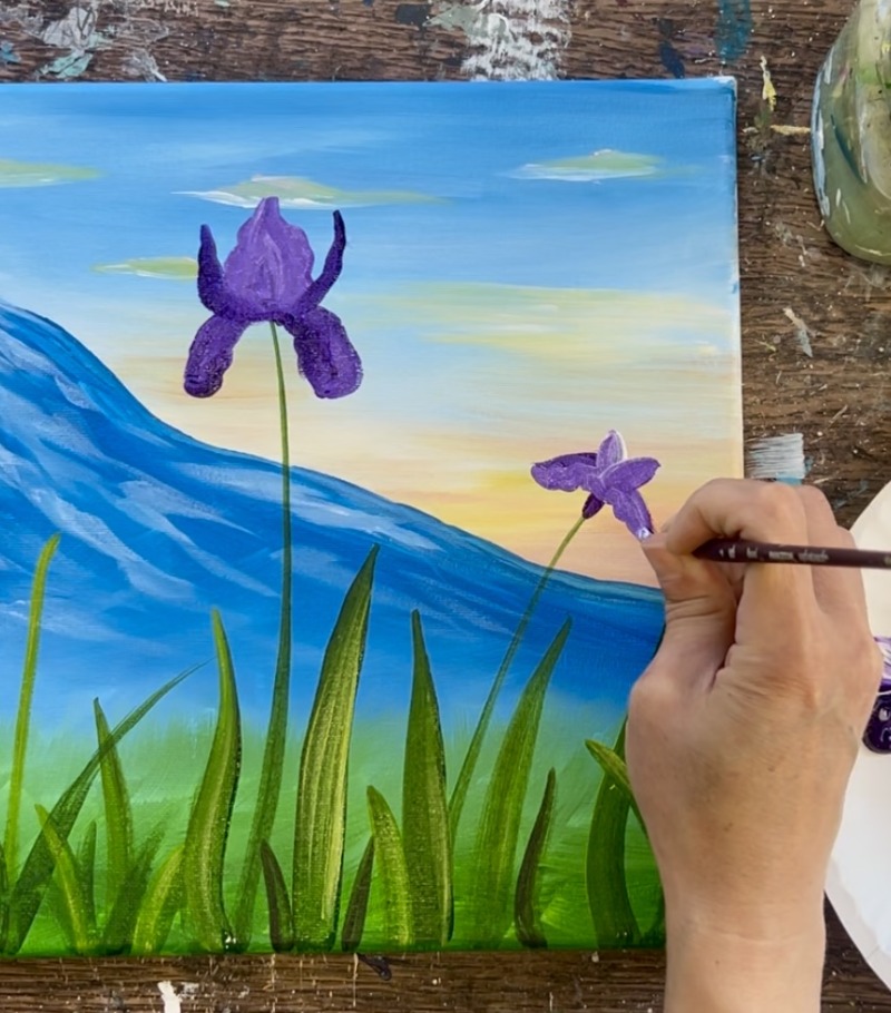
You can use titanium white to help some petals stand out (or you can do this later after you paint all the shapes). I like the blend the white with the purple before it dries.
Paint some buds and lower flowers. The buds are little oval shapes with a very fine pointed tip on the top.
I did another two opened iris flowers on the lower left. The color variations you see in the purple are done by loading the brush in different amounts of the white and purple.
Paint a few tiny irises that appear further away in the landscape.
After painting the iris shapes, go back and do more detail on the stems, specifically the part of the stem that expands wider and holds the flower (the spathe). Make the green in this area just below the flower go wider. Additionally, paint some green leaves overlapping the iris buds. Also, make sure you paint stems that attach to any of the floating iris flowers you added!
Then you can go back and add more detail to the iris petals. I did “veins” on the large iris on the right side of the mountain. Use titanium white and the purple to mix a very light purple. Then paint little vein lines on the left and right side of the iris. I decided to do vein lines on only this large petal.

Then start adding your yellow areas on the petals. First, paint titanium white for the base of the color. This will ensure your yellow shows up bright. Use the #4 round brush and lightly brush just the base of the petal. Then add yellow on top of the white.
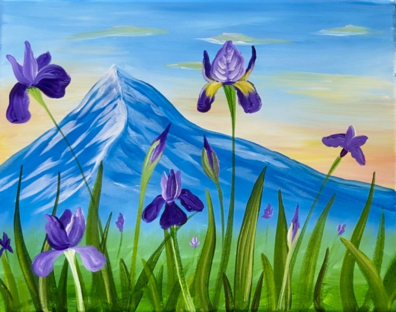
Alternatively, you can “double load” your brush in both white and yellow and then brush on your yellow color. Add your yellow colors to all of your petals that are going downwards.
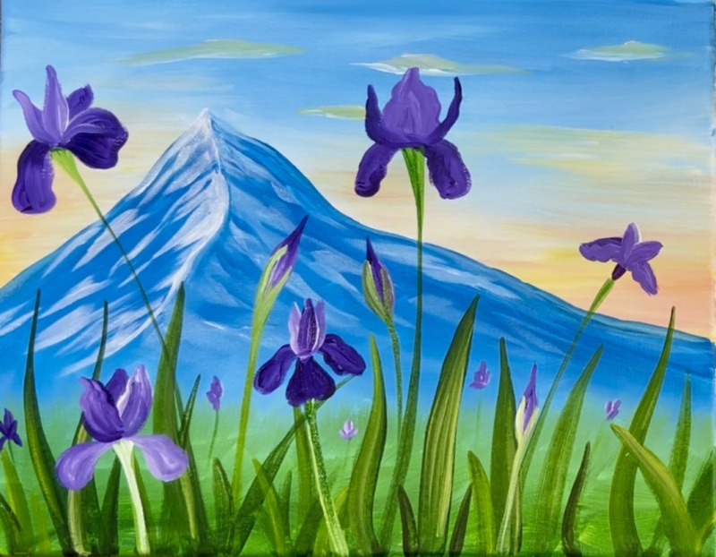
Add more details to your petals including adding a second coat of purple to the edges, making the edges more “wavy”, adding white to some of the edges of the upwards petals, etc. You can keep these flowers looking abstract or more representational of irises! They don’t have to be realistic. Add a few more irises where you would like them! I added one more larger bloom on the lower right of the grass area.
Another final touch up you can do is add brighter yellow/green color grass blades on the bottom of the canvas. This adds some pretty contrast against the dark color leaves we painted earlier. It also adds a pop of color and extra texture in this area! You could also add a butterfly, bee or other bug in this painting for a pop of color!
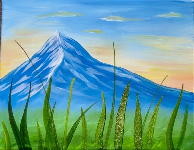
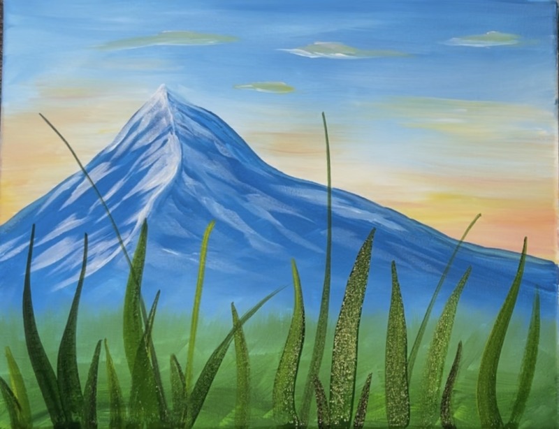
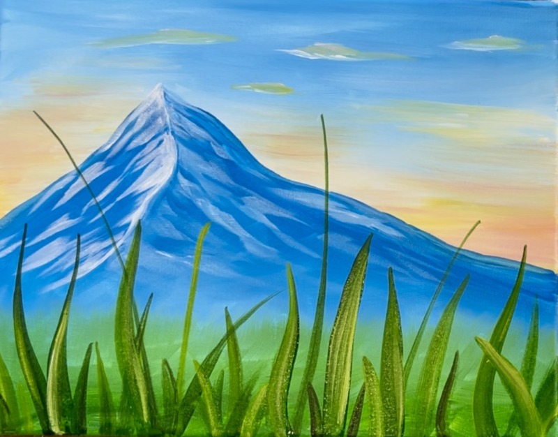
Finished!

Omg some of the pictures didn’t load getting to the ending but overall, beautiful painting, very, very nice. I nean, this something I would like to be hanging over my bed. Good job, thanks for sharing.